Entry · Ref 2XNYNGSJ
Why Smart Website Design Solutions Start with User Experience
- Posted
- 2026-10-06
- Last amended
- 2026-10-06
- Account
- @gobsi69qk1
Getting the Foundation Right
When I started building sites for small businesses back in 2013, the conversation almost always began with colours and fonts. Clients wanted something that looked "modern" without knowing what that meant. Over the years, I have learned that the best website design solutions come from asking harder questions first: Who is visiting this site? What do they need? And how can we remove every obstacle between them and that need?
That shift in thinking matters because a site that looks beautiful but confuses visitors will not help your business grow. I have seen companies spend thousands on a redesign only to watch their bounce rate climb. The culprit was almost always a mismatch between the visual design and the actual user experience. The site looked sharp on a desktop monitor but made mobile visitors pinch and zoom to read text. That is not a design problem. It is a strategy problem.
Responsive Design Is Not Optional
Early in my career I worked with a local bakery that insisted on a fixed-width layout because that is what the owner saw on her own laptop. I pushed back hard. Today, over half of web traffic comes from mobile devices. If your site does not adapt to the screen size, you are turning away potential customers before they even see your menu. Responsive design used to be a nice-to-have. Now it is a baseline requirement for any credible website design solution.
I typically build responsive sites using a mobile-first approach. That means I start the design process on a small screen and then scale up to tablet and desktop. It forces me to prioritise what really matters: the content, the call to action, the navigation. Everything else is secondary. Tools like Figma and Adobe XD make it easier to prototype responsive layouts and share them with clients before a single line of code is written. That saves time and prevents costly revisions later.
Choosing the Right CMS
One of the first decisions you will make is which content management system to use. I have worked with WordPress, Wix, and Shopify, and each has its strengths. WordPress remains the most flexible option for custom website design solutions. It gives you full control over the code, the hosting provider, and the plugins you install. But that flexibility comes with responsibility. You need to keep the core software and plugins updated, choose a reliable hosting provider, and install an SSL certificate to secure data in transit.
For ecommerce sites, Shopify is often a better fit. It handles payment processing, inventory management, and shipping out of the box. You trade some design freedom for a faster setup and lower ongoing maintenance. Wix sits somewhere in the middle. It is great for small brochure sites or portfolios, but I do not recommend it for anything that needs complex data structures or high traffic volumes. The key is to match the CMS to your actual needs, not to what is popular.
Performance and Analytics Go Hand in Hand
A fast site is a good site. Page speed directly affects user experience and SEO. Google has used page speed as a ranking signal for years, and they recently introduced Core Web Vitals as part of their ranking criteria. If your site loads slowly on mobile, you will rank lower and lose visitors. I run every site through Google's PageSpeed Insights tool before launch and again after any major update. Common fixes include optimising images, enabling browser caching, and reducing the number of third-party scripts.
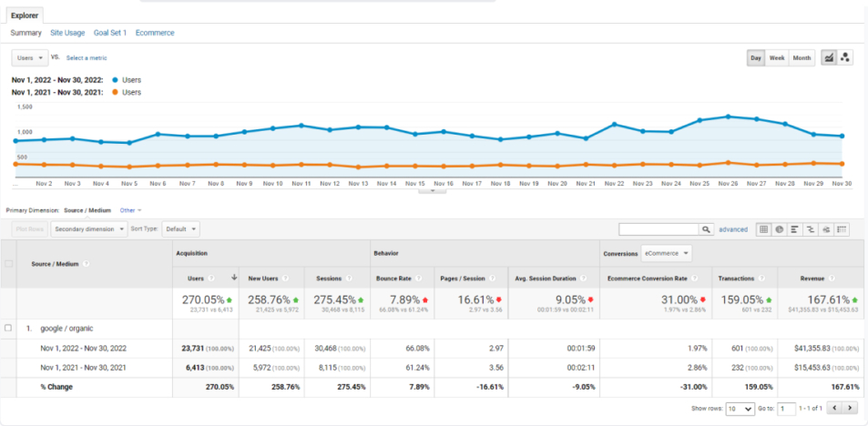
Once the site is live, you need to know what is working. I install Google Analytics on every site I build. It gives you data on traffic sources, user behaviour, and conversion rates. But raw numbers are not enough. You have to look at the patterns. For example, if you see a high exit rate on a landing page, that might mean the call to action is not compelling or the page takes too long to load. You can dig deeper with a heatmap tool to see exactly where users click and where they stop scrolling. That kind of insight turns guesswork into a real strategy.
Conversion Rate Optimisation through Testing
The best website design solutions are never finished. They evolve based on real data. A/B testing is one of the most effective ways to improve conversion rate optimisation. I once worked with an online retailer who changed the colour of their "Add to Cart" button from green to orange and saw a 12% lift in sales. That is a tiny change with a big impact. You can test headlines, images, button copy, form fields, and even the placement of trust signals like SSL certificate icons.

I recommend running A/B tests on one variable at a time. If you change the headline and the button colour at the same time, you will not know which one caused the improvement. Tools like Google Optimize or VWO make it straightforward to set up experiments and measure statistical significance. Just remember that A/B testing requires traffic. If your site gets fewer than a few hundred visitors per day, the results may not be reliable. In that case, focus on qualitative feedback from user interviews or session recordings.
SEO from the Start
Search engine optimisation is not something you sprinkle on after the site is built. It has to inform the structure from the beginning. I plan the site architecture, URL hierarchy, and internal linking strategy before I open any design tool. That includes keyword research for each page, writing meta titles and descriptions, and ensuring that every image has descriptive alt text. A well-structured site helps Google understand your content and improves the chances that your landing page will rank for relevant terms.
Technical SEO also matters. An SSL certificate is non-negotiable for security and ranking. A clean URL structure with hyphens instead of underscores is easier for users and search engines to read. And a sitemap.xml file helps Google discover all your pages quickly. I submit the sitemap to Google Search Console right after launch and monitor for any crawl errors.
Putting It All Together
At the end of the day, website design solutions are about solving real problems for real people. The technology changes fast. New tools like Figma and Adobe XD replace older ones. Wix and Shopify offer new features every quarter. Google updates its algorithms constantly. But the fundamentals stay the same: know your audience, build for speed, test your assumptions, and keep improving. That is what separates a site that collects dust from one that drives real business results.
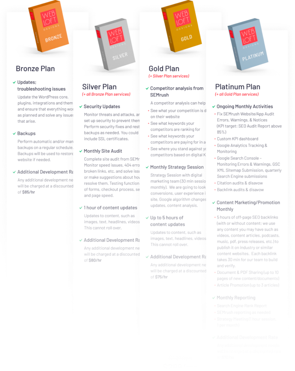
I have seen too many companies treat their website as a one-time project. They design it, launch it, and forget about it. A year later, the design looks dated, the content is stale, and the analytics show a steady decline in traffic. The smartest clients I work with treat their site as a living asset. They invest in ongoing maintenance, regular content updates, and periodic design refreshes. They run heatmaps and A/B tests to find small wins. They monitor page speed and optimise images. That discipline compounds over time.
If you are planning a new site or a redesign, start with the data. Look at your current Google Analytics numbers. Identify the pages with the highest bounce rates and the lowest conversion rates. Talk to a few customers and ask them what they find confusing. Then work with a designer or agency that asks those same questions. The best website design solutions are the ones that make your visitors feel understood and guide them effortlessly toward the action you want them to take.